We reimagined YUMI with bold color, unconventional layouts, and emotive photography.

With two growing boys at home, my wife and I are always thinking about the life-long impact of the food we model on our dinner table. If we put ultra processed, sugar-filled foods in front of them, we can only expect a continued cycle of poor nutrition. If we put the correct portion of whole foods in front of them, with the occasional treat, we set them up for smarter nutritional choices to come naturally. Because we’re always thinking about food and nutrition, when YUMI approached us to refresh their brand design system in time for their biggest launch to-date, it was both exciting and personally relevant.
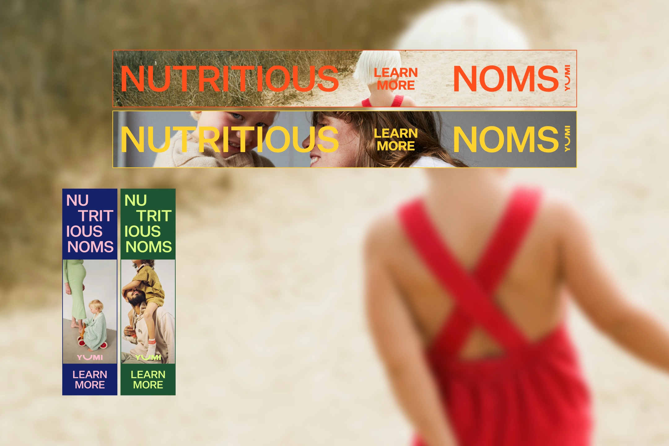
Prior to our refresh, YUMI’s brand design system was conservative in color and type. They used their deep burgundy color disproportionately and relied on uninspired typography/layout. Because their product positioning was transitioning from kids to families, we expanded the brand’s use of color and employed unconventional, playful typography/layout to communicate a renewed sense of energy and optimism to a wider audience. In support of the more lively brand, we also reinvented the playful YUMI “letter jumble” with careful consideration for bold color combinations paired with voyeuristic, high emotion, family-centric photography.
This project was uniquely satisfying because it was for a brand with shared values, at a moment that could not be more relevant in my journey.
Kyle Wai Lin, Creative Director
Josephine Wai Lin, Creative Director
Caitlin Coble Choate, SVP of Brand
Caroline Cho, Producer
Jessica Hägg, Designer
Joe Lechford, Designer
Tiffany Pan, Designer